This presentation has an introduction to our work and a little bit about how far we’ve come.
The following will build on what’s in the above presentation.
We’re trying to create an elevation map for the planet of Venus. An elevation map is just like a regular map, except for every latitude and longitude, we will know the height of the land. Mountains will be high, valleys will be low, plains will generally be in the middle.
We’d like to create a picture of the Venusian surface that can be referenced by latitude and longitude; stored at the latitude and longtitude will be a number which states how high the surface is at that location.
Before we continue, let’s look at some background of this mission. People produce elevations maps all the time of Earth. Of buildings, cities, and the whole globe. It’s common. The challenges of this project lie in what makes this job different from others; what makes existing tools incompatible with the information available.
People have been looking at Venus since they’ve had telescopes. There were prior attempts to image Venus’ surface. Chapter 1 of the Magellan Guide speaks more about this; early attempts gave scientists just enough detail of the terrain for them to know they needed even more detail. Enough detail to raise questions about Venus’ terrain. So the Magellan mission was organized. The missions right before Magellan were the Soviet Veneras 15 and 16 which obtained radar images of 25% of Venus’ surface with resolution \-(1km\-) or better.
The Magellan satellite was launched on May 4, 1989 and arrived at Venus August 10, 1990. Mapping operations started September 15, 1990 and ended around September 1992 (mgn-guide page 4).
What did the magellan mission achieve?
Magellan carried an altimeter on board, but the resolution of the height data is very large—on the order of 10km in between each sample, and is not always reliable. In mountainous regions, errors in altitude can be as large as a kilometer (radar-venus–1991 page 1). The point of this project is to get elevation measurements of better resolution.
There is another possiblity, though. We have elevation maps and 3D models of the Earth, cities, and buildings. We tend to use photogrammetry for that; we figure out how tall things are by taking pictures from different perspectives under similar lighting conditions. This is called stereogrammetry. Applying stereogrammetry to optical photos is called photogrammetry, and applying stereogrammetry to radar images is called radargrammetry. This works somewhat like how we percieve depth; by seeing something from two different perspectives (our two eyeballs), differences in the locations of the object clue us into how large and far away the object is.
Many space missions have used stereogrammetry to study the altimetry of different planets. The mission happened before later tools for stereogrammetry (getting elevation data from a pair of images from different perspectives of the same region) were developed. So the data isn’t immediately usable with known tools for performing stereogrammetry. Common stereogrammetry tools aren’t compatible with it for futher reasons: this is radar data, not optical data and must be handled a little differently; and most tools can’t handle planetary data.
papers+documents/MGN-FBIDR-SIS-SDPS-101-RevE.pdf. Each F-BIDR is a collection of 20 files (and some extra metadata files, whose extension is .lbl) which contain both image data and metadata about the image and spacecraft. This document describes the binary format of some of the files in detail (Files 12–19), and also describes the meaning of the information, but is not sufficient alone for interpretation. From here on in, will be called just FBIDR SIS.papers+documents/19940013181.pdf. This is broader in scope and less terse than the F-BIDR SIS. It goes over details of the mission, contains a lot of definitions for important terms and concepts in the way that satellites function, and the way that the radar on the satellite functions as well. For actual image interpretation, Chapters 2 and 5 of this document are valuable. From here on, will be called just Magellan Guide. The guide is also available hereLastly, the actual images are not optical images; they are not created by reflected visible light from a surface. This was done for different reasons, but one of them being thick clouds that cover Venus. Radiation that could penetrate the clouds had to be used.
So for an accurate map of elevation for Venus, techniques that rely on images of the surface have to be used, because that’s what’s available, could produce results more accurate and at higher resolutions than the on-board altimeter.
There’s supposed to be image data of Venus’ surface. Where?
Each F-BIDR is a collection of 20 files, much of which is metadata. Files 12–19, as specified in the FBIDR SIS are comprised of pieces called logical records. Files 13 and 15 have logical records which contain both satellite metadata and image data from the radar. The satellite metadata helps us understand which part of Venus’ surface the image corresponds to, so that the pieces can be joined together into larger pictures which represent a whole orbit, or multiple orbits.
Each pixel represents \-(75m^2\-) of Venus’ surface. They’re 75m wide and tall. A radar on Magellan emitted radiation from a small dish and captured some of the radiation back a small amount of time later. The intensity of the pixel is the intensity of the reflected radiation. What precisely this means we can’t quite say yet. More reading to do. It’s easier to start off with what it isn’t.
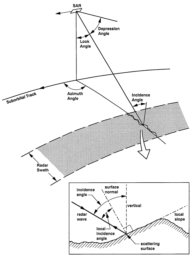
What the intensities tell us is how capable a given patch of land was at reflecting the radiation back toward the satellite. Chapter 5 of the Magellan Guide goes into more detail about this, but here’s a summary. First, an image describing various terms on satellite orientation toward the surface. The SAR is the radar dish on the magellan satellite. If I talk about satellite orientation, I’m really talking about the orientation of this dish.
Demonstration of satellite orientation terms. Caption from original figure: Geometry of radar image acquisition. The depression angle is complementary to the look angle; the incidence angle may be affected by planetary curvature. Local incidence angle may be affected by local topography.
A note: incidence angle and look angle are not the same. On the radar swath in the image (the shaded grey bar on the surface) is a thin black line that crosses the swath, along with a squiggly. The line represents an assumed reference surface, and the squiggly is the actual surface. The reference surface is flat in the picture, but it doesn’t have to be. Actual surfaces often aren’t flat. The picture-in-picture insert describes this well: there’s the local incidence angle, which is the actual incidence angle the radiation makes with the actual (squiggly) ground.
There’s a few things that affect how capable a patch of land is at reflecting radiation: the incidence angle (the angle between the radiation and the surface struck by it), the roughness of the ground, and the patch having very reflective materials. If a patch has more reflective materials, then generally the intensity of the pixel representing that patch will be greater. For the other two parameters, the explanation is less straightforward; incidence angle and roughness have an interplay, as shown in the following 2 figures:
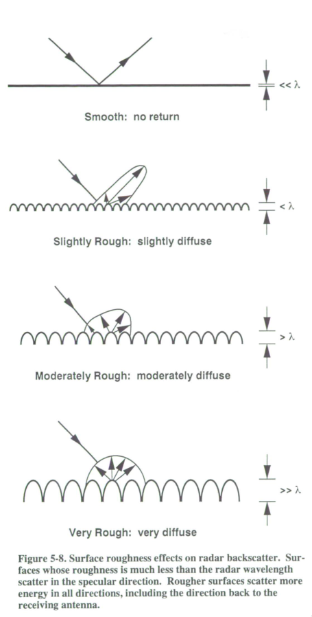
Demonstration of reflectivity of 2 different surfaces
In the very top image, the surface is flat so it acts like a mirror. Radiation hits it and then bounces away. If the incidence angle is small, then the radiation will probably bounce back toward the radar causing very bright intensity (radar-bright); if the incidence angle is large, then the flat ground will show up dark (radar-dark).
The more rough the ground, the less intensity will shoot right back at the radar in any one direction because the radiation will be spread out in different directions; however regardless of the incidence angle, radiation is more likely to go back to the radar than miss it. The following graph shows this in more detail. Higher radar backscatter means higher pixel intensity.
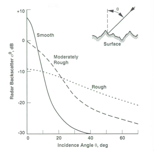
Backscatter vs incidence angle for different surfaces
Notice that the graph for rough ground changes less with incidence angle while the graph for flat ground changes a lot with incidence angle.
Here’s two radar images of some mountains in California which display the difference between different incidence angles. They’re of the same region; the dark bottom of the top image is not the night sky (we thought it was for a moment), but flat ground from a high incidence angle (50°). There are bright dots in the dark region of the top photo; look for them in the bottom photo to be able to compare the two regions. The pictures are basically the same scale and width and height.
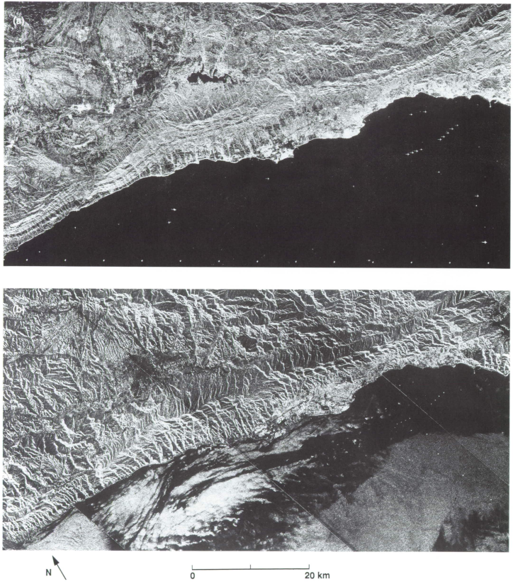
Comparison of incidence angle effects at California Mountains